
Mobile vs Desktop Performance in 2026
Your website likely performs very differently on a phone than on a desktop. Understanding why — and testing for both — is essential for SEO and user experience in 2026.
What you'll learn
- →Why mobile scores are almost always lower than desktop
- →How Google's mobile-first indexing affects your rankings
- →The real-world differences in how users experience speed on each device
- →Practical optimization strategies for both mobile and desktop
- →How to use SnapSiteScan to test and compare both environments
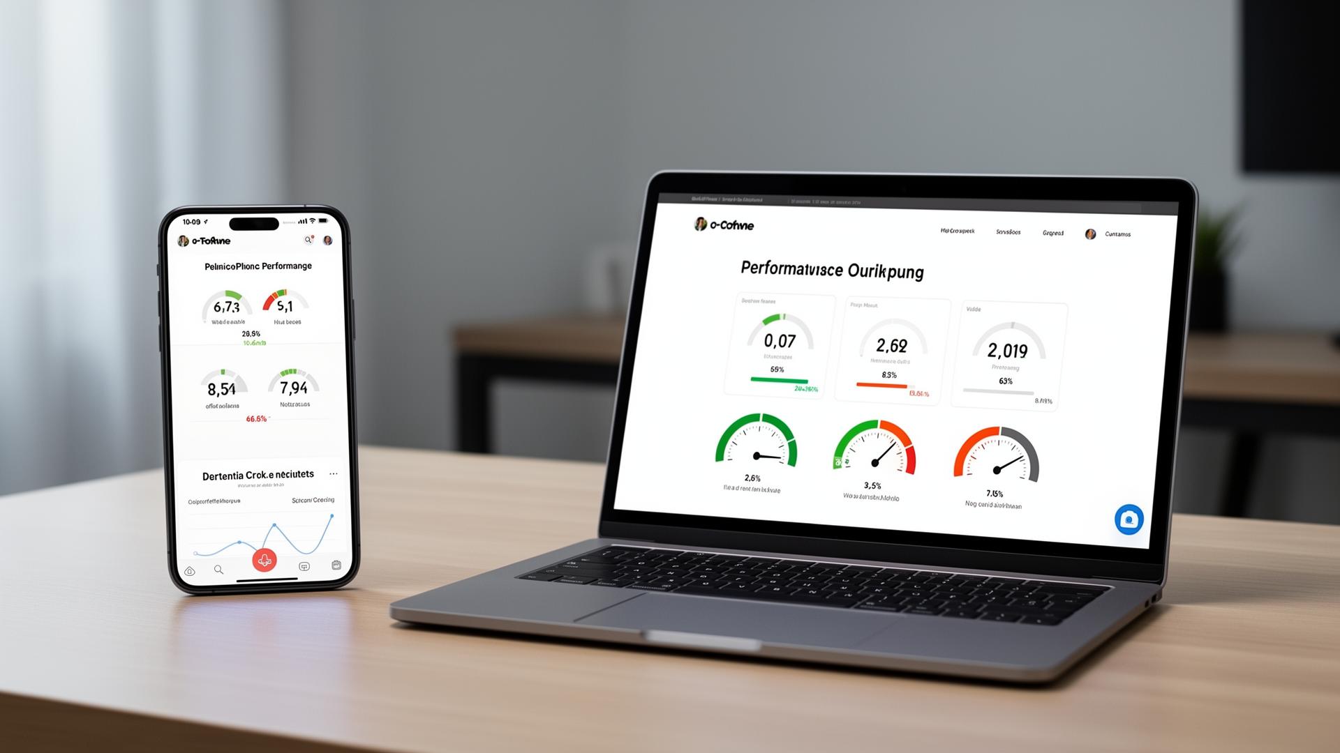
If you've ever run a speed test on your website and noticed your desktop score is 90 while your mobile score is 55, you're not alone. This gap is one of the most common — and most misunderstood — aspects of website performance in 2026.
The difference isn't a bug. It's a reflection of how dramatically the conditions differ between the two environments. Understanding these differences isn't optional anymore — it's critical for SEO, user retention, and conversions.
Why Mobile Scores Are Almost Always Lower
When Google PageSpeed Insights tests your mobile performance, it doesn't test your site on a high-end iPhone with a 5G connection. Instead, it simulates a mid-range Android device on a throttled 4G connection. This is intentional — it reflects the experience of the majority of mobile users worldwide.
The simulation includes significantly reduced CPU power and network speed. A page that loads in 1.5 seconds on desktop might take 4–6 seconds under these throttled conditions. The result: dramatically lower scores for the exact same page.
The mobile test isn't unfair — it's realistic.
Over 60% of global web traffic comes from mobile devices, and many users don't have flagship phones or fast connections.
Google's Mobile-First Indexing: What It Means for You
Since 2021, Google has been using mobile-first indexing for all websites. This means Google primarily crawls and ranks your site based on its mobile version — not the desktop version.
If your mobile experience is slow, cluttered, or missing content that exists on desktop, Google sees the weaker version. In 2026, this has become even more pronounced as Google's ranking algorithms increasingly weigh mobile Core Web Vitals — particularly Interaction to Next Paint (INP) — in search results.
A site that looks perfect on desktop but struggles on mobile is essentially invisible to Google's quality signals. Your Core Web Vitals must pass on mobile to receive ranking benefits.
The Real-World Impact on Users
Mobile users behave differently than desktop users. They're often on the move, multitasking, and far less patient. Research consistently shows:
- 53% of mobile users abandon a page that takes more than 3 seconds to load
- Mobile bounce rates are typically 10–20% higher than desktop
- Conversion rates on mobile are 2x lower than desktop — often due to poor performance
These aren't just numbers. Every slow-loading mobile page represents lost customers, lost revenue, and lost trust. As more commerce, content consumption, and service interactions shift to mobile, the stakes continue to rise.
What Causes Mobile-Specific Slowdowns
Many performance issues only appear — or become severe — on mobile devices. The most common culprits include:
- ✓Unoptimized hero images that are served at desktop resolution on small screens
- ✓Heavy JavaScript bundles that overwhelm limited mobile CPUs
- ✓Third-party scripts (analytics, chat widgets, ad trackers) that block rendering
- ✓Web fonts loaded without proper fallback strategies
- ✓Layout shifts caused by dynamically injected ads or lazy-loaded content
What's often overlooked is that mobile devices have significantly less processing power. A JavaScript task that takes 50ms on a modern laptop may take 200–400ms on a mid-range phone. This directly impacts Interaction to Next Paint (INP) and overall responsiveness.
How to Optimize for Mobile Performance
The good news is that mobile-specific optimizations often benefit desktop users too. Here are the most effective strategies for 2026:
1. Serve Responsive Images
Use the srcset attribute and the <picture> element to deliver appropriately sized images for each screen. A 1920px hero image should never be served to a 390px phone screen. Modern formats like WebP and AVIF offer 30–50% smaller file sizes compared to JPEG.
2. Minimize and Defer JavaScript
Code-split your JavaScript so that only critical scripts load initially. Use defer or async attributes on non-critical scripts. Consider removing or delaying third-party widgets until after the page becomes interactive.
3. Optimize for Touch Interactions
Mobile users interact differently — they tap, swipe, and scroll. Ensure buttons are large enough (minimum 48×48px), that tap handlers respond instantly, and that scroll performance remains smooth. These factors directly influence your INP score.
4. Reduce Server Response Time
Mobile connections add latency. A fast server response time (TTFB) becomes even more critical on mobile because every millisecond counts when the connection itself is slower. Use edge CDNs and server-side caching to minimize this.
Desktop Optimization Still Matters
While mobile-first indexing gets the spotlight, desktop performance isn't irrelevant. Many B2B websites, SaaS platforms, and productivity tools still see 50–70% desktop traffic. E-commerce purchase completion rates remain higher on desktop.
Desktop-specific optimizations include taking advantage of larger screens with higher-resolution imagery, using hover states effectively, and leveraging the greater processing power for richer interactive experiences — without neglecting load time.
How to Test Both Environments Properly
The key to understanding your performance is testing both mobile and desktop separately. SnapSiteScan allows you to switch between mobile and desktop strategies with a single click, showing you exactly how each environment performs.
- ✓Run separate tests for mobile and desktop
- ✓Compare Core Web Vitals side by side
- ✓Identify device-specific bottlenecks
- ✓Track improvements over time with scan history
The Bottom Line: Test Both, Optimize for Mobile First
In 2026, a website that only performs well on desktop is a website that's falling behind. Google ranks based on mobile performance, most users browse on phones, and the gap between mobile and desktop scores will only grow if you don't actively address it.
Test your website on both mobile and desktop. Understand the differences. Then optimize where it matters most — starting with mobile.
Scan your website instantly and see what's slowing it down. For a complete approach, read our complete website audit guide.
Related Articles
Compare mobile and desktop scores
See how your website performs on both devices with a detailed performance comparison.
Scan Your Website Free